

Identity & app — 2025Scroll
Pure
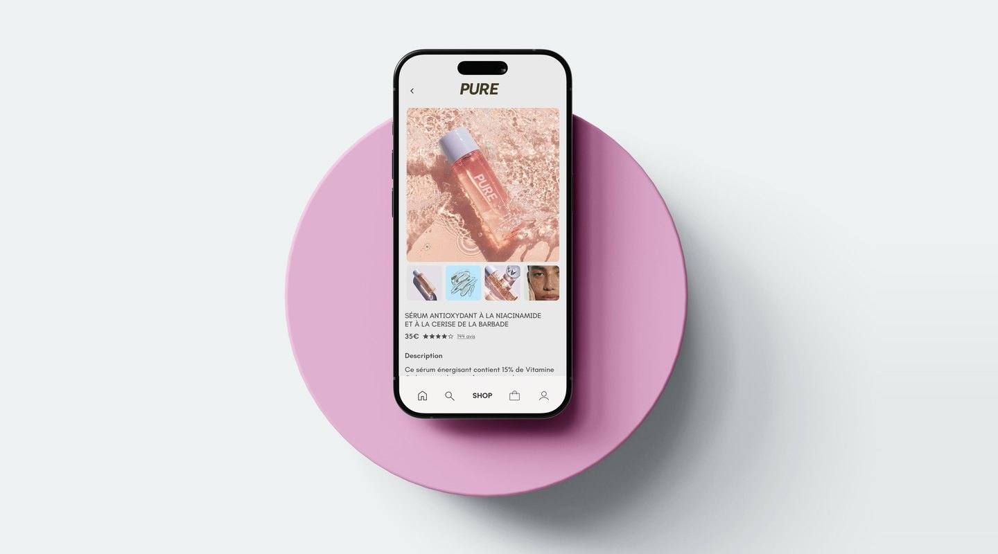
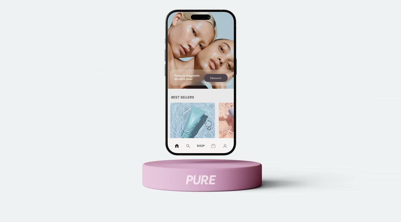
Brand identity and mobile app for Pure, a skincare brand built around personalised skin diagnosis. Users identify their skin type and concerns, then receive a tailored routine and product recommendations.
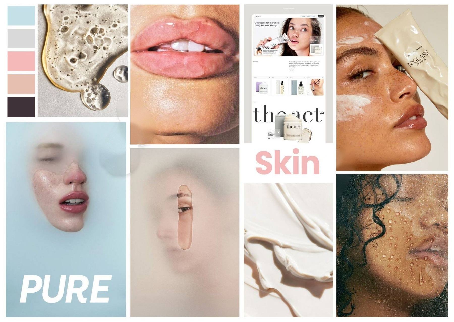
01Moodboard
02The logo
Movement and softness.
A bold italic wordmark set in Brother 1816. Its forward slant brings energy, while its rounded forms keep the softness of the brand.

AubergineWhite
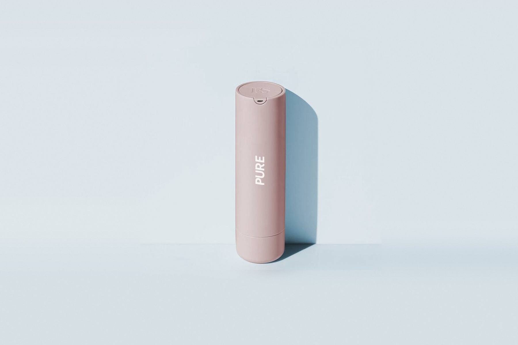
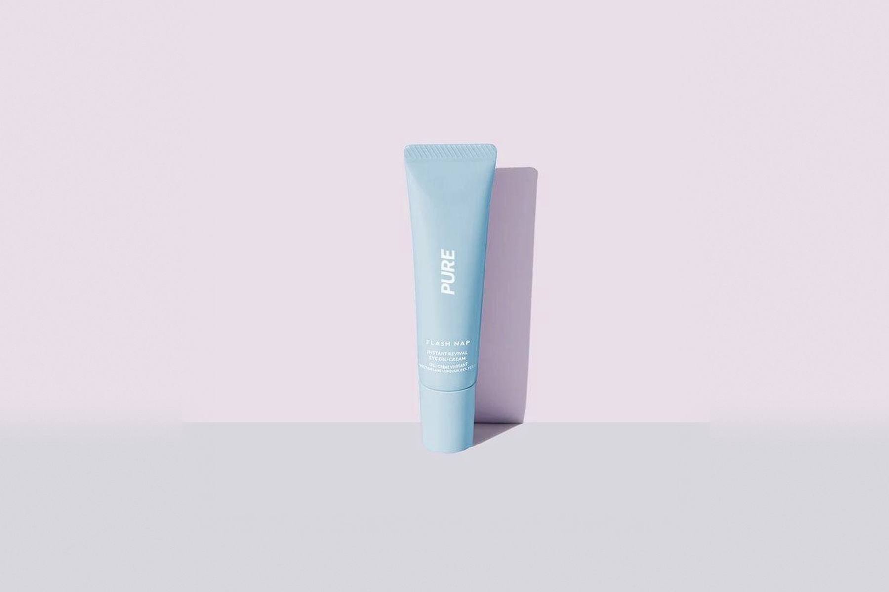
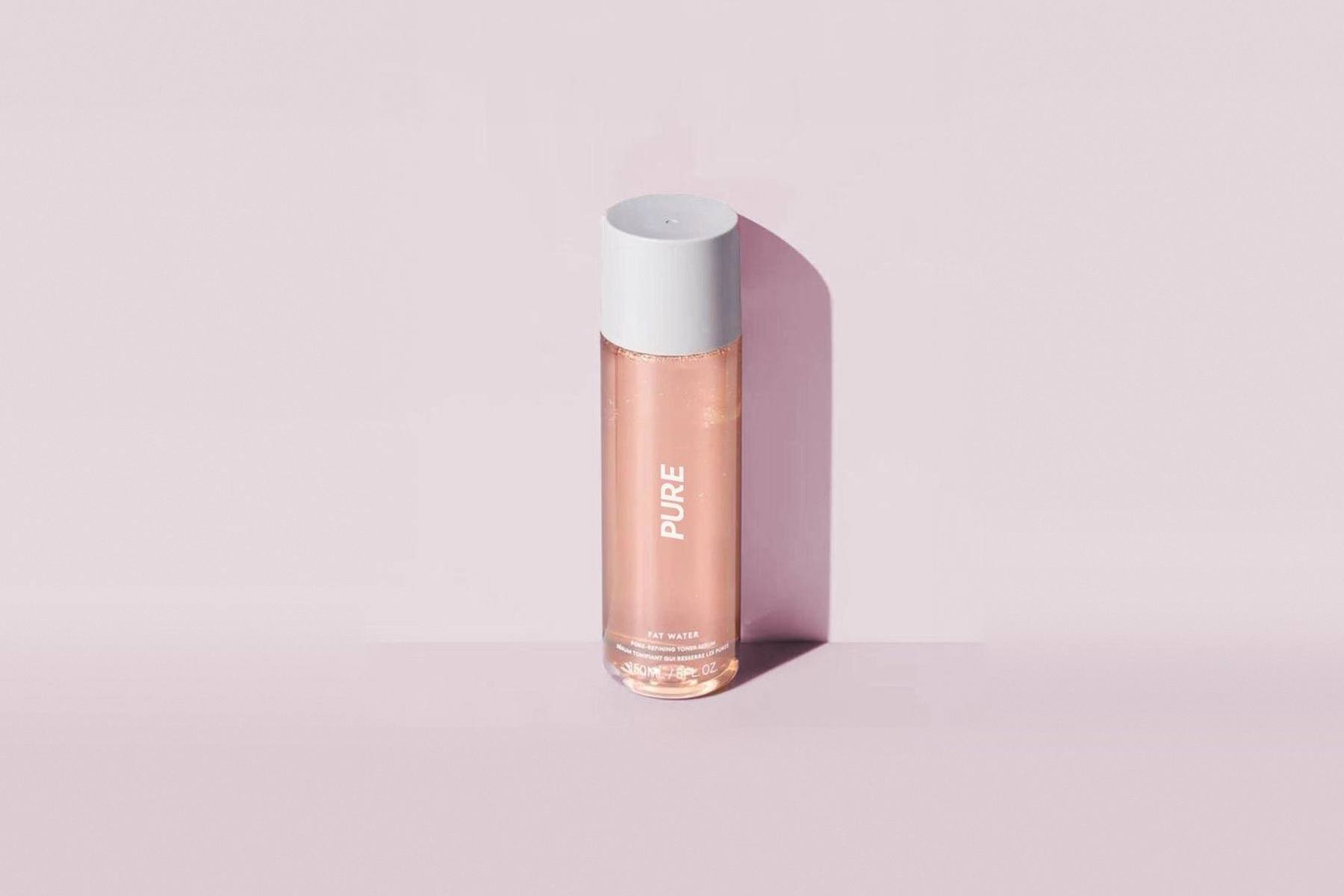
03Products
Three pastels, one gesture.
04Colour
Skin, water and aubergine.
Powdery pastels anchored by a deep aubergine.
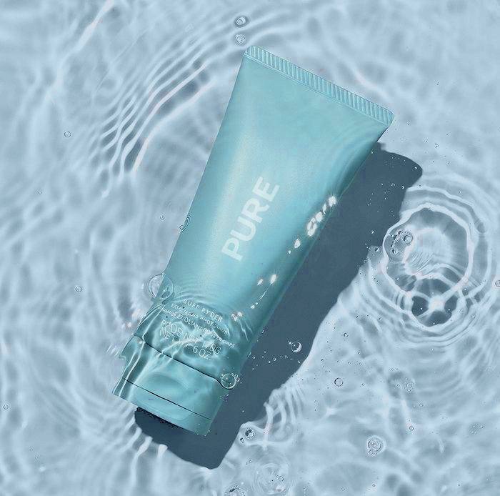 Water#C5E0E7
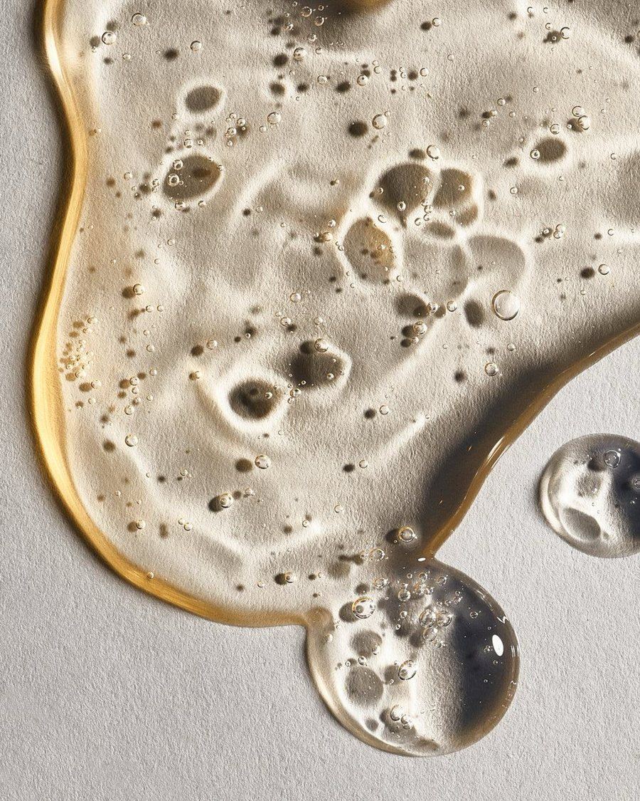 Mist#D9D9D9
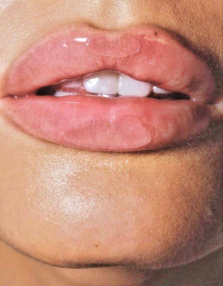 Rose#F5B9B9
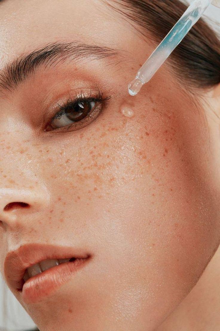 Peach#E6BFB0
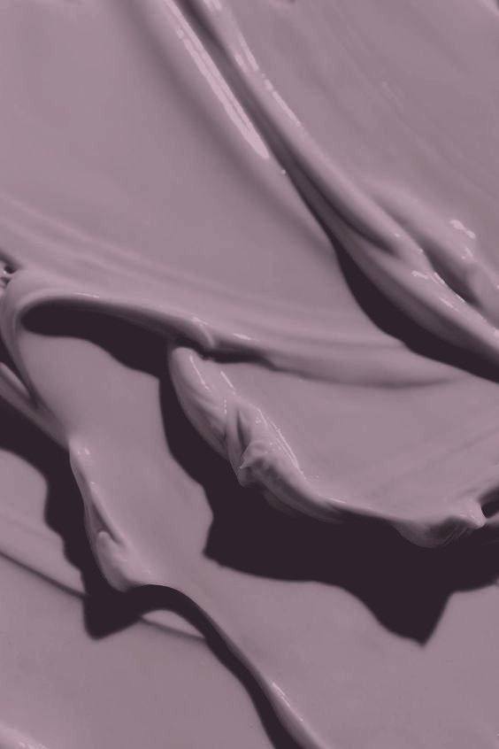 Aubergine#3F3239
05The app
A diagnosis at the heart.
From the home screen, users start their diagnosis, find their routine, then search, discover product pages and check out.